Project Background
Timeline
Client
Goal
Tools Used
2 weeks
National Park Service of Boston
Provide a way for groups of people to coordinate a tour of their choosing
Axure, Sketch, InVision, Miro, Trello, Otter
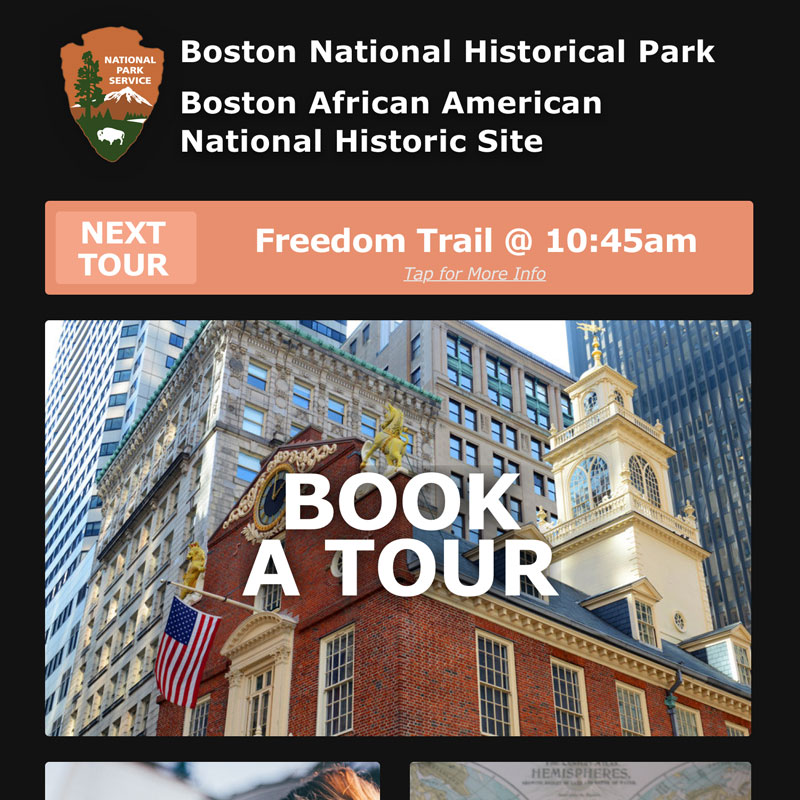
The Boston National Historical Park is an association of sites that showcase Boston's role in the American Revolution. The sites are connected by the 2.5-mile-long Freedom Trail, a walking tour of downtown Boston. More than 3 million visitors walk the Freedom Trail each year.
The National Park Service of Boston currently has a native mobile app that provides information about the historical sites, available tours, and maps of the park areas, but it does not provide a way for groups of people to plan a visit to the Freedom Trail, especially if those groups only want to visit certain locations, or need to coordinate meeting times amongst each other.
Project Overview
Summary
Over the course of two weeks, our team was tasked with adding a conceptual feature to the Boston National Park Service iOS mobile application that allows more flexibility for groups who wanted to explore the Freedom Trail.
My Role
Working as part of a four-person team, my role was first and foremost to facilitate time management and keep our assets and deliverables organized. I also mapped out the existing site’s information architecture, and then altered and polished that architecture to incorporate the features we were building. Lastly, I created a clickable prototype from the completed visual designs.
Problem Statement
Users want a way to easily book tours with specific specifications, such as tour type, time, length, group size, and cost in advance or same day for one or more people.
Design Process
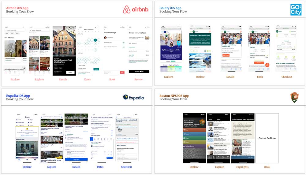
Competitive Analysis
Over the first several days of the project, the researchers looked into the direct (and indirect) competitors. and discovered that since the NPS Boston app does not have any tours that require payment, it is not in direct competition with anyone. There are similar services, such as an official freedom trail tour, however, these cost money and offer more in-depth information and comprehensive audio tours than the NPS Boston app.

We also looked into the mobile booking aspects for Expedia, Go City Card, GPSmyCity, and AirBnB, in order to garner ideas about the ways people book things to do online.
User Research
Our user research consisted of four steps:
Recruitment
Screeners
Questions
Interviews
Online, in-person
10
12
6
User Interviews
In order to determine individuals to include within our user research, we created a preliminary screener survey to find individuals that had formerly organized group trips, as this was our target audience for the new feature within the application. After going through ten responses, we selected six users to connect with and interview.
Synthesizing Findings
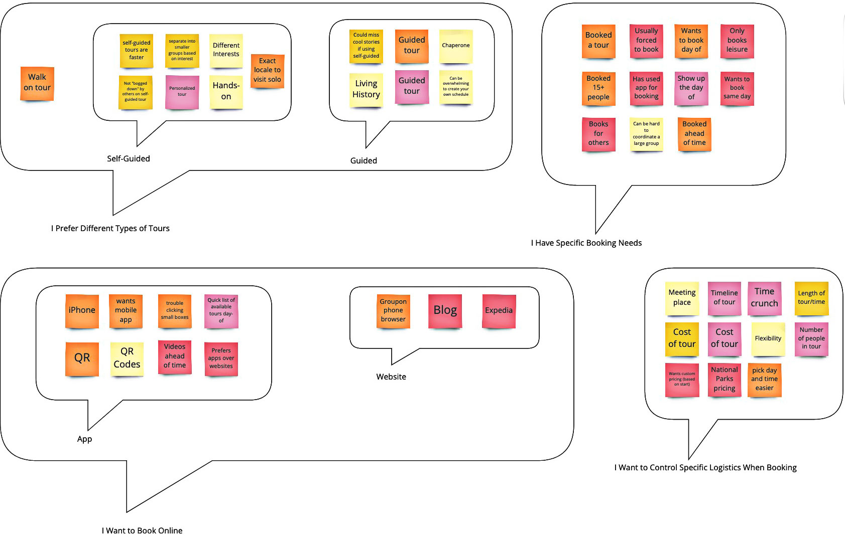
We were able to gather some very valuable feedback which we then analysed through affinity mapping. The main points that we needed to address within our design were:
- I have specific booking needs (duration, price, time, sites)
- I prefer different types of tours (guided versus self-guided)
Our findings also revealed some pain points:
- ability to share tour times and itineraries was lacking, therefore making it more difficult to coordinate times and locations with others
- not able to save sites of interest so that they could be used to create a self-guided tour without having to search for them again
What I would like to know about a specific tour would be the timeline of the tour with the costs of the tour... I don't want to pay an arm and a leg, especially because I may or may not like it.- Research Participant
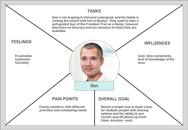
Stepping Into The Users’ Shoes
From our findings, we created the proto-persona of Dan. Doing so allowed us to keep the user at the center of the design process, ensuring we met his goals. We created a scenario in order to frame the problem and focus on the user needs as we moved forward.
Ideating
Design Workshops
Conducting three rounds of design workshops, we explored some ideas for the scenarios to refine what should be included in our MVP. This also helped us visualize the navigation and elements in the existing interface that were not working and develop our new information architecture.
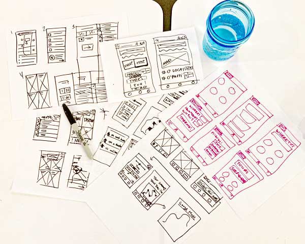
Paper Prototypes
From the design workshops, we created a user flow. We developed this into a paper prototype and conduct usability tests. We discovered that some of our initial language choices were confusing, and we were able to iterate and re-test.
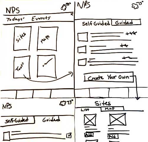
Mid-Fidelity Prototype
We then developed a mid-fidelity digital prototype, conducting further usability tests and refining the design before moving it into a high-fidelity mockup.
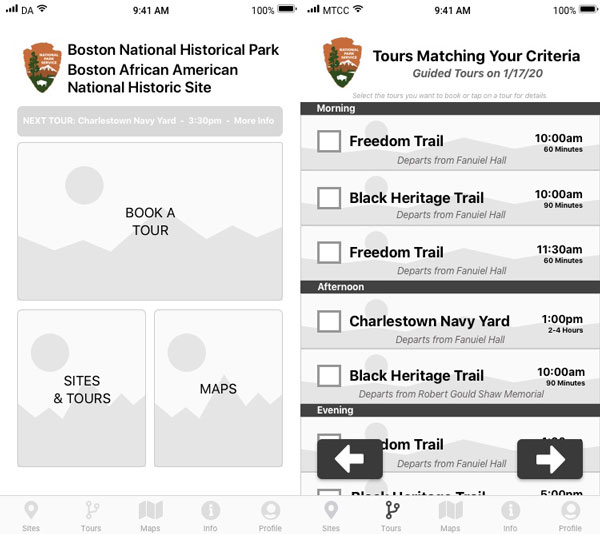
High-Fidelity Prototype
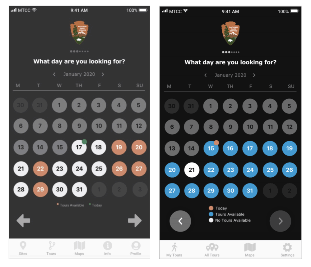
Usability testing on the high-fidelity mockup showed that our initial color choices on the calendar where users choose the date they want to take a tour were confusing. Altering these colors made it more clear to users which dates were available. We also adjusted the information architecture to make the ability to save custom tours more easily accessible and understandable.
The new design of the app provides users with the ability to:
- Plan a self-guided tour for a group of people that allows users to visit any or all of the sites on the tour in the order and time-frame they prefer
- Share maps and itineraries with group members to facilitate time and location coordination
The redesigned National Park Service app was received very positively by users. Users stated the app was not only simple and easy to navigate, but helped them feel more confident in being able to plan an outing with others.
V2 and Reflections
Moving forward, we can envision future iterations of the National Park Service app including:
- GPS integration
- more visual maps for people who are not local
- additional languages for people from other countries
- being able to share location information more accurately
- creating a guest option for people who don’t want to make an account
- include estimated duration of the each site on the tour